

Bull-O-Rama began as a class-wide advertising assignment for Northwest Mississippi Community College’s annual rodeo event. Each student developed a campaign direction, with one concept potentially selected for the event’s actual promotion.
The assignment focused on typographic hierarchy: determining which details needed to be seen first, which information could remain secondary, and how that order should change from one format to another.
The original deliverables were a poster, social-media banner, and VIP pass. For this portfolio presentation, I adapted the horizontal banner into a billboard and created a vertical Instagram post, expanding the project into a four-piece campaign.
Disclaimer: Student project created for Northwest Mississippi Community College. This is not official current advertising for Bull-O-Rama.
Visual Direction
I built the visual direction around a dark red texture, Western-inspired typography, and a cutout photograph of the bull and rider supplied for the assignment.
The repeated Bull-O-Rama headline uses stars in place of the hyphens to give the title more character without turning it into a separate logo. White typography creates a strong contrast against
the textured background, while the rider’s blue clothing connects naturally to Northwest Mississippi Community College’s red-and-blue palette.
The texture, title treatment, photograph, and sponsor marks remain consistent across the campaign, while the layout and hierarchy change according to each format.
POSTER
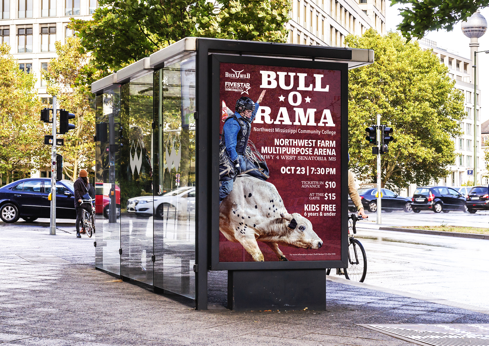
The poster carries the most complete set of event information, making hierarchy the main challenge of the composition.
I established the Bull-O-Rama title as the first point of entry, followed by the venue, date, time, and ticket details. The sponsor logos and contact information remain present at a quieter level so they can be found without competing with the information viewers need first.
The bull and rider anchor the left side of the poster, leaving a clear area for the event details while adding movement to the composition. This separation allows the information to remain readable despite the number of required elements.
Billboard
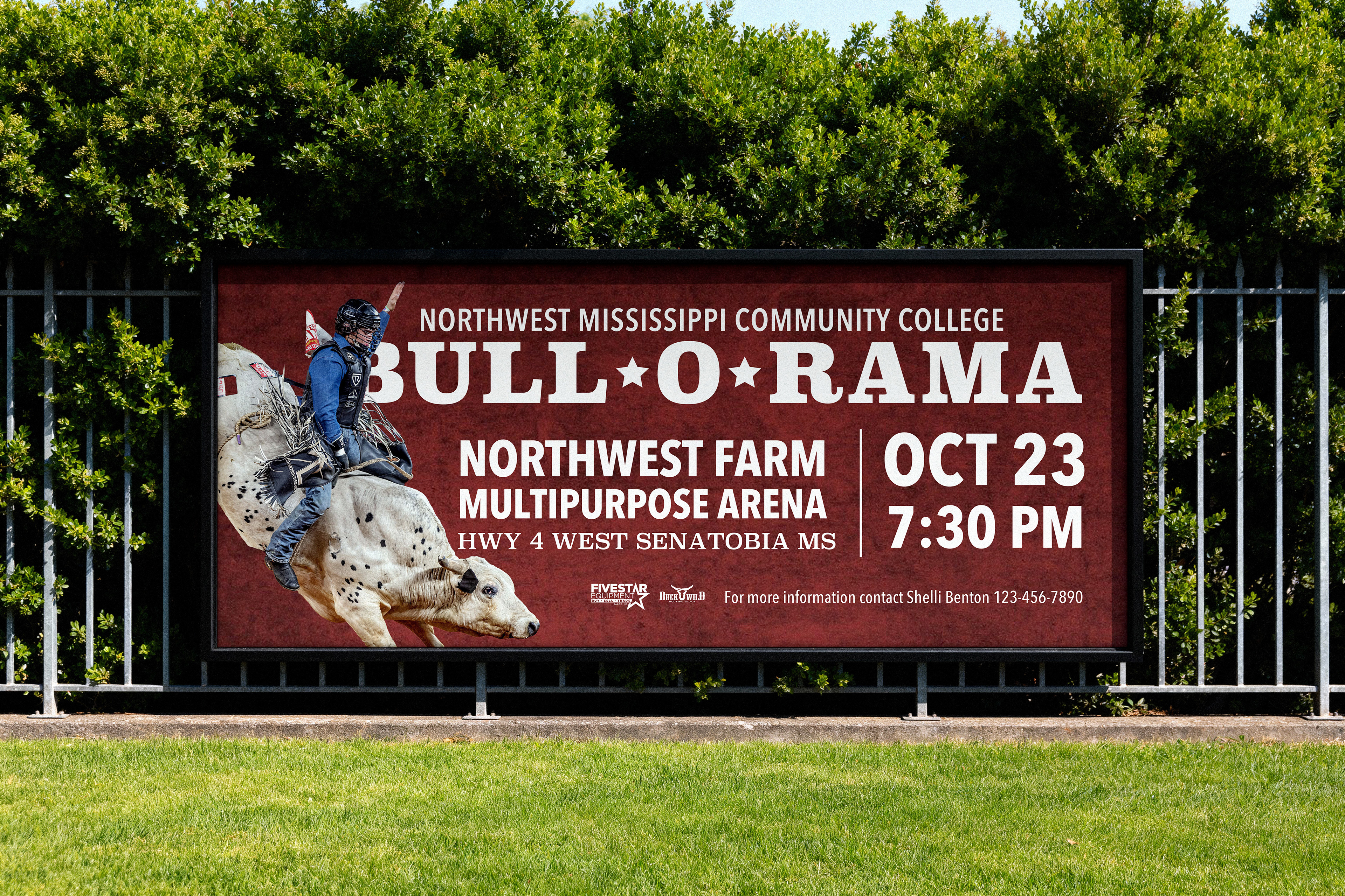
The billboard simplifies the campaign for a wider format and a shorter viewing time. I removed the ticket information and reduced the hierarchy to the event title, location, date, and time, with the contact line remaining secondary.
The horizontal structure allowed the bull rider, venue, and schedule to occupy distinct areas rather than competing within one dense block. A vertical divider separates the location from the date and time while keeping the layout visually connected.
Because the mockup represents a sidewalk-scale billboard, the design retains slightly more information than I would include on a highway billboard.
Social Media
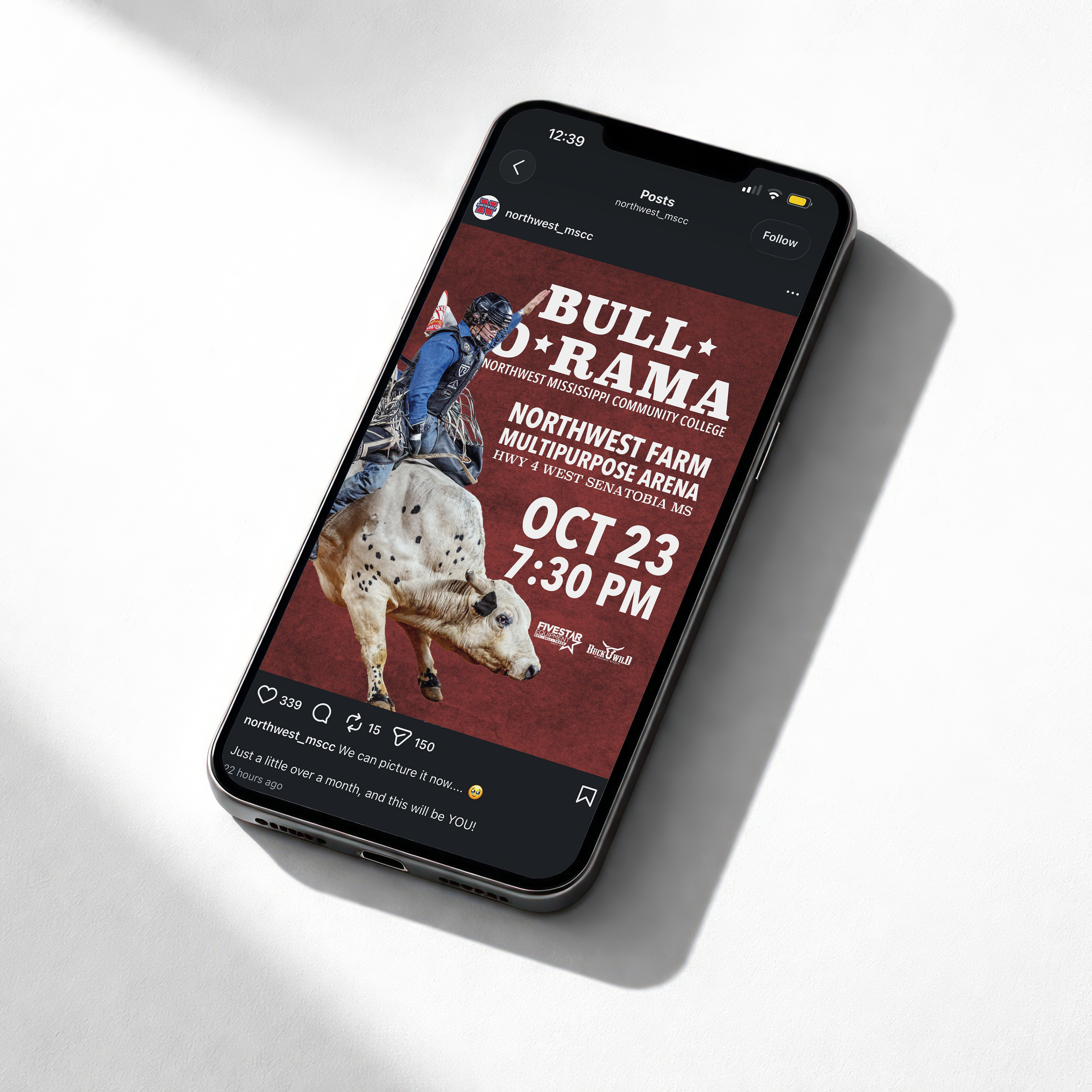
The original assignment included a horizontal Twitter banner. I later replaced it with a vertical Instagram post that better reflects how promotional content is viewed on social media today.
The narrow format required a different approach to hierarchy because both “Bull-O-Rama” and “Northwest Farm Multipurpose Arena” are lengthy. Instead of giving the venue immediate secondary priority, I made the date and time the strongest information after the event title.
The bull and rider were repositioned to work within the vertical frame, while the title, texture, typography, and sponsor marks preserve the identity established in the other campaign pieces.
Additional contact information could be placed in the caption, allowing the graphic itself to remain focused and readable while someone scrolls.
VIP Tag
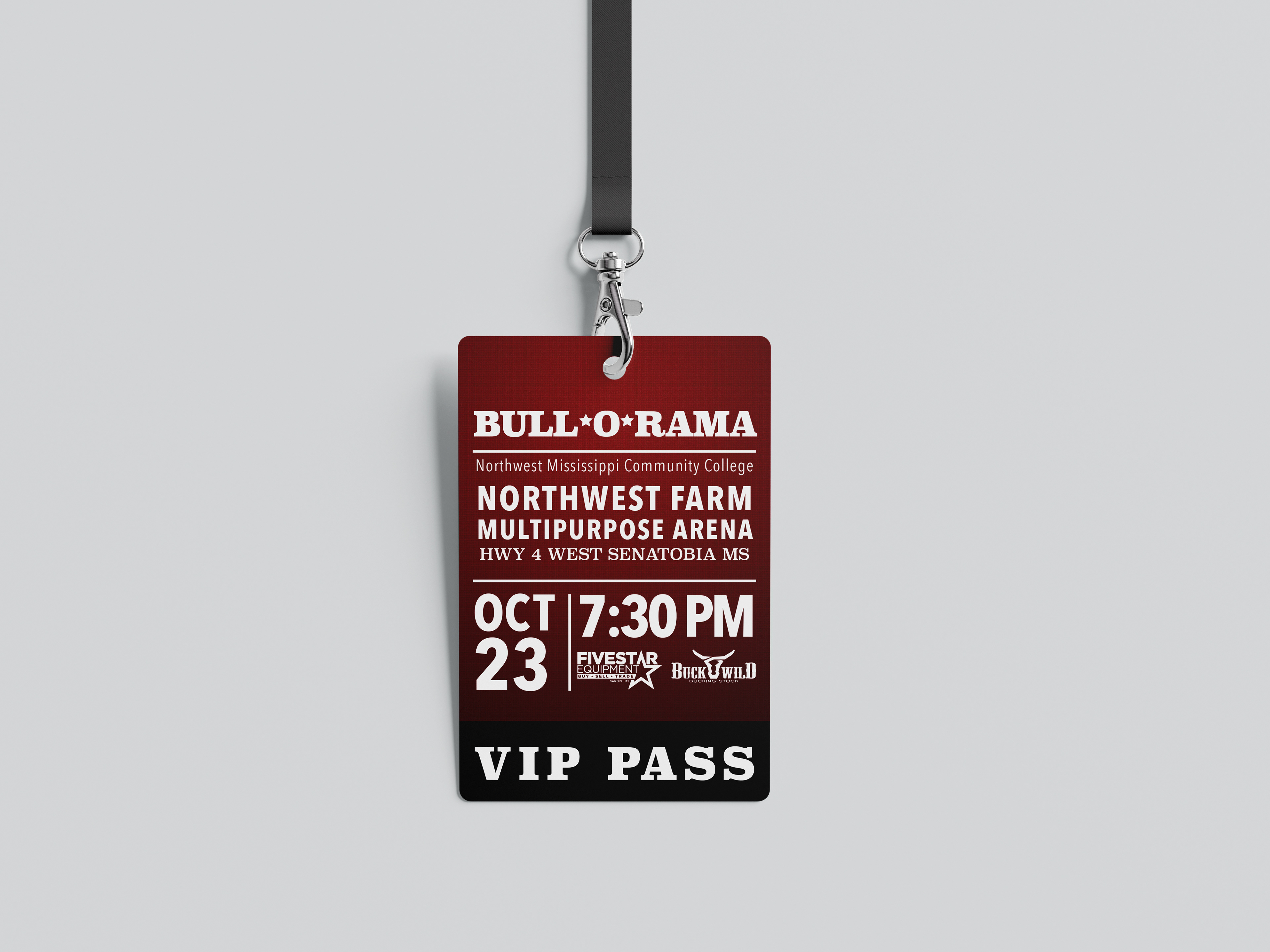
The VIP tag carries the campaign identity into the event while also serving a practical purpose. It identifies the holder, supports access control, and provides a compact reminder of the event location, date, and time.
Because the tag is much smaller than the promotional pieces, I compressed the information into a direct vertical sequence rather than shrinking the poster layout.
The black band separates VIP PASS from the event details so staff can recognize the credential immediately. The sponsor logos remain visible but secondary, allowing the access designation and essential information to remain clear.
This project explored how one campaign can remain recognizable while changing its hierarchy for print, outdoor advertising, social media, and event materials.
Rather than resizing one composition into several formats, I adapted the information and layout to match how each piece would actually be viewed.